Joseph Noto's Portfolio
Global Health & Life Expectancy Analysis
Overview
I participated in a group project focused on developing a machine learning model to predict life expectancy using World Bank Health, Nutrition, and Population Statistics from Kaggle, along with a country-region mapping dataset. This project covered a full data pipeline: from cleaning and reshaping decades of country-level health data, exploring the story behind the numbers, clustering countries by region and health profile, and building regression models to predict life expectancy. Models built include standard Linear Regression, Ridge, Lasso, and Elastic Net. These models were compared to each other to see which one was most efficient for making predictions. Beyond the modeling aspect, the real focus was using the data to display how health and geography shape how long people live across the globe.
Project Goals
- Identify which health indicators are most associated with life expectancy
- Clean and reshape the World Bank dataset into a usable dataframe
- Group countries based on similarities in health characteristics
- Build regression models to predict future life expectancy
- Evaluate model performance using multiple metrics
Data Preparation
The raw World Bank Health dataset came in a wide format with one column for each year. So, the first step was to melt it into a long format with one row per country, health indicator, and year. From there, missing values were interpolated linearly within each country-indicator group, and indicators with more than 50% missing data were dropped entirely rather than trying to force them into the model. To reduce noise and make trends easier for us to read, yearly data was aggregated into averages by decade.
With over 100 different health indicators dispersed throughout this dataset, redundant and highly-correlated features also had to be trimmed down. Indicator pairs with a correlation above 0.80 were flagged, and only the feature more strongly correlated with life expectancy was kept from each pair. The dataset also had breakdowns of various health indicators for males and females. These gender-specific indicators were also excluded to keep the focus on total population trends. The final set of indicators was broken down into categories for education, healthcare access, infectious disease, etc. to keep things interpretable rather than just throwing every remaining column at the model.

Above is a screenshot of the first five rows of our cleaned and reshaped dataset
Exploratory Analysis
The following trends were noted during EDA:
- Global average life expectancy climbed steadily across decades, and the variance between countries decreased over time.
- Individual country trajectories revealed real historical events hiding in the data. For example, countries like Cambodia, Rwanda, and Mali all have significant drops in life expectancy due to war, genocide, economic collapse, and famine.
- Correlation analysis showed other life-expectancy and survival related metrics moving in the same direction, while mortality-related indicators moved inversely.
- Outlier detection using IQR bounds helped confirm which countries were true statistical outliers versus just low performers, which helped shape how we interpreted the clustering results later on.
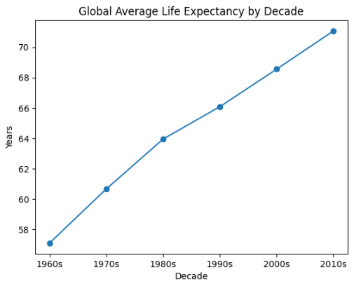
Overall, life expectancy globally increased decade by decade, indicating that more countries were developing to provide better outcomes for their people
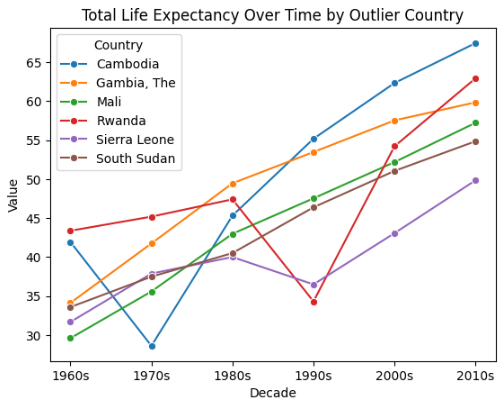
Certain countries, like Cambodia, Rwanda, and Sierra Leone, suffered significant drops in life expectancy for a given decade as a result of civil wars & economic collapse
Clustering
K-Means clustering was applied to group countries by similarity across health indicators. The right number of clusters was chosen by comparing results from the elbow method against silhouette scores across k=2 to k=10. We found that k=4 was the best balance for this clustering.
The results mapped cleanly onto real-world groupings:
- Cluster 0 — mostly Eastern European Countries — avg. life expectancy: 69.2 years
- Cluster 1 — lower-income Sub-Saharan African & southeast Asian Countries — avg. life expectancy: 52.7 years
- Cluster 2 — high income, developed nations — avg. life expectancy: 75.8 years
- Cluster 3 — a more diverse mix of Latin American, Southeast Asian, Middle Eastern, and Caribbean Countries — avg. life expectancy: 68.2 years
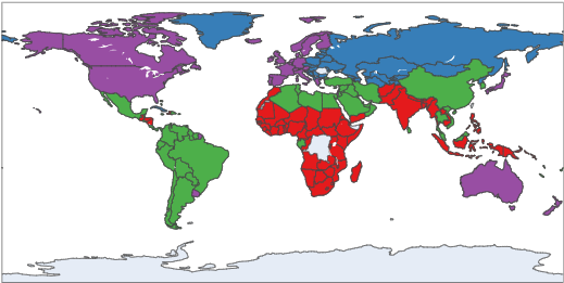
Map displays by color the countries in the same clusters as a result of k-Means Clustering
Predictive Modeling
Evaluated several regression approaches to predict total life expectancy, all trained on a proper train/test split:
- Linear Regression (health + decade + region) - the full model, including categorical decade and region indicators alongside health features
- Linear Regression (health only) - a stripped down version using only health indicators, to isolate their predictive value on their own.
- Ridge, Lasso, Elastic Net - regularized versions of the health-only model, each tuned with a 5-fold cross validation.
Visualizations
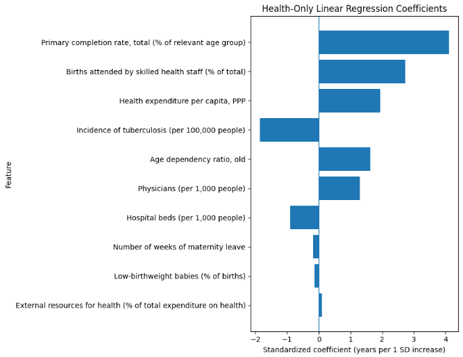
Top Health Coefficients
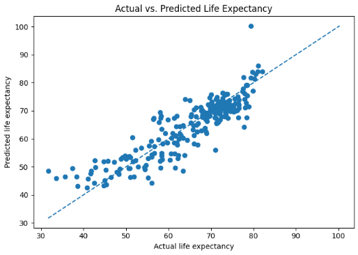
Actual vs Predicted Life Expectancy for the health-only regression model
Model Evaluation
Evaluated model performance using MAE, RMSE, R^2, plus 5-fold cross validated RMSE for the regularized models. Final Results:

Results
The full model that combined health indicators with decade and region information outperformed every health-only model, explaining about 87% of the variance in life expectancy with an average error of roughly 3.2 years. That gap between the full and health-only models showed that health indicators alone did not tell the full story. Adding time and geography allowed the model to capture real trends like medical progress over time and regional disparities in infrastructure and policy. Among the health-only models, Lasso edged out Ridge and Elastic Net likely due to its zeroing out of irrelevant coefficients and keeping the model lean.
Technologies
- Python
- Pandas
- Scikit-learn
- Matplotlib
- Seaborn
- Google Colab
Key Takeaways
Working through this project showed me how important the storytelling behind data analysis is compared to the modeling. The results of our machine learning models only became meaningful once we could tie them back to real historical events and trends. It reinforced how much groundwork goes into an effective model. Data cleaning, reshaping, and trimming down redundant information was just as important as the type of model we chose to run the data on. We found that health indicators alone left a meaningful amount of variance on the table, and that more information was needed to tell the story behind life expectancy trends. Working in a group also reinforced how useful it is to have multiple people sanity-checking feature selection and modeling decisions along the way, rather than working in a vacuum.